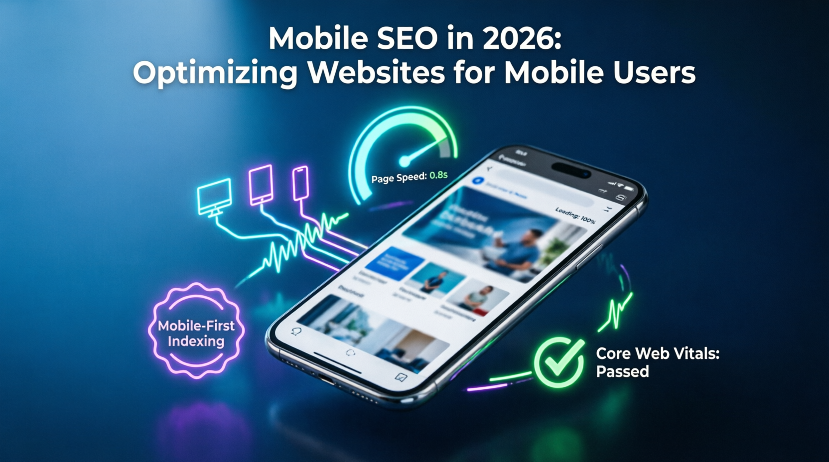
Introduction
A website may look excellent on a desktop computer but still provide a poor experience on smartphones.
Mobile SEO focuses on making websites easy to access, navigate and use on smaller screens.
Responsive Design
Your website should automatically adapt to different screen sizes.
Important elements include:
- Readable text
- Proper image scaling
- Mobile-friendly navigation
- Touch-friendly buttons
- Responsive layouts
Mobile Performance
Large images and unnecessary scripts can slow down mobile pages.
Businesses should optimize:
- Images
- JavaScript
- CSS
- Fonts
- Third-party scripts
- Caching
Performance should be monitored continuously rather than only during website development.
Mobile Conversion Optimization
A mobile visitor should be able to:
- Find your services
- Call your business
- Submit a form
- Request a quote
- Make a purchase
without unnecessary friction.
Why Mobile SEO Matters
Mobile optimization improves more than SEO. It improves the complete customer experience.
A faster and easier website can reduce friction and create more opportunities for conversions.
Leave a Reply